Boudoir Bedroom
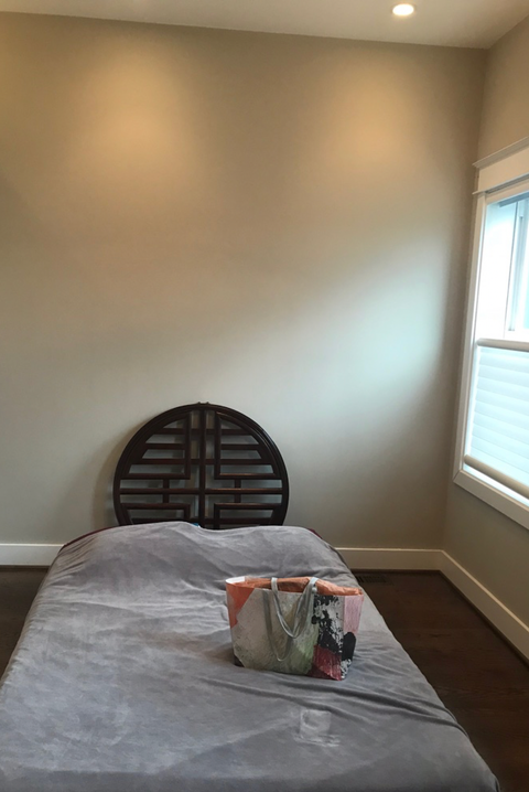
Spunky, sassy and sexy: Those are just a few of the design directives Washington, D.C.-based designer Zoe Feldman followed to transform a 1913 rowhouse for a well-traveled, thirty-something client. Now filled with Mid-Century pieces, an extensive art collection, and wallpaper patterns galore, the home wasn't quite in tip-top shape when Feldman signed on—especially when it came to the master bedroom.
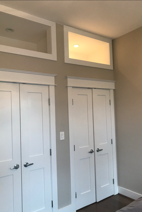
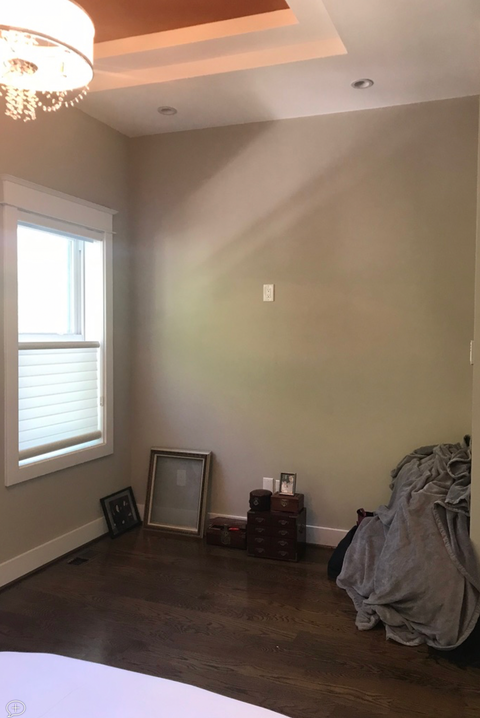
While it had plenty of potential, there were a "few awkward moments, like multiple closet doors and a funky tray ceiling," recalls Feldman. She began by simplifying the space, replacing the three doors with two, then sourced pieces that fit easily into the quirky layout. Her inspiration: a retro (but not cliché) New Orleans-style boudoir. Read on for the before-and-afters—and for Feldman's top transformation tips
Zoe Feldman
STACY GOLDBERG
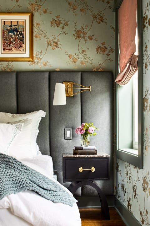
Go With a Custom Bed
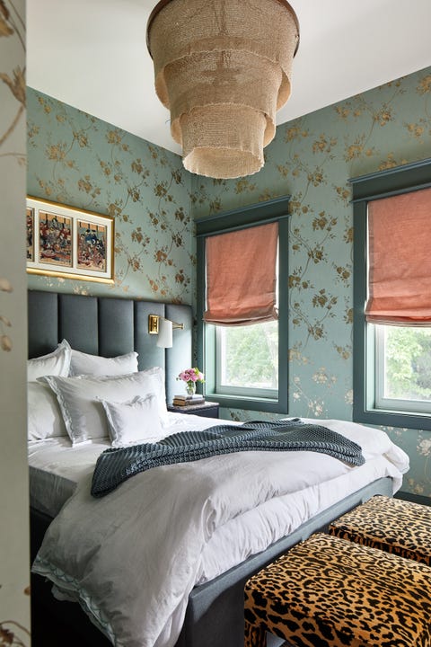
Custom pieces make a big impact and are a great way to work with local artisans, says Feldman, who designed a built-in bed. "We upholstered the whole back wall to make it a cushy, comfy space," says Feldman. By integrating the electrical wiring, she was able to install swing-arm sconces right into the headboard wall—goodbye, tangled cords!
Jazz Up Your Trim
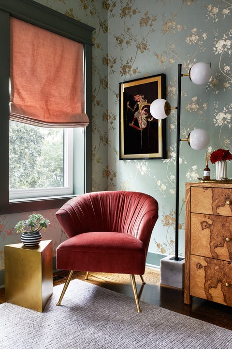
The gold-and-aqua Cowtan & Tout wallpaper paired with slightly darker painted trim around the windows creates a gradient-like effect. "It's all one palette," she says. "We think it makes the best environment for sleeping."
Zoe Feldman
STACY GOLDBERG
Relaxed Romans for the Win
To keep the room from being too stiff, Feldman outfitted the windows with relaxed Roman shade that swoop at the bottom. "Anything too severe would have created too much contrast with the softer curvature in the room," she says. "It adds a romantic moment while still allowing the natural light during the daytime."
Add the Right Lighting
Because the ceiling is so tall, a tiered pendant in a light, natural material felt more serene than a fussy chandelier. Feldman suggests hanging your light fixture above the bottom third of the bed—not in the center—for an optimum focal point.
Zoe Feldman
STACY GOLDBERG
Animal Print is the New Neutral
Feldman chose a pair of stools from Ballard Designs upholstered in Serengeti Camel fabric. "We bonded petty quickly over our love of animal print," Zoe says. "It's a good way to add some spunk, it gives the room an edge, but it's still very neutral." Bonus: using two smaller stools instead of a long bench means more seating options when friends come to visit.
Follow House Beautiful on Instagram .
This content is created and maintained by a third party, and imported onto this page to help users provide their email addresses. You may be able to find more information about this and similar content at piano.io
Source: https://www.housebeautiful.com/design-inspiration/house-tours/a32838695/zoe-feldman-bedroom-makeover/
